
For our current campaign, we have decided to create the required landing pages completely in-house according to the minimum principle. From the point of view of a UX agency, we are also trying to create a balance between the processing of customer projects and our own agency development.
Within the guidelines of 'good quality', 'low costs' and 'low development and reaction time', we can cover the necessary resources for conception, design and project management as far as possible internally. Only frontend development is missing in our team.
This is where so-called website builders come into play. With these construction kits, professional websites can be created in a short time, without further IT knowledge. We compared different website builders and finally decided on Squarespace.
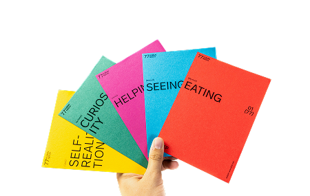
The preliminary work regarding concept and design has already been done. Thanks to short internal coordination channels, we managed to create eight landing pages in a short time. Now it's time for the technical implementation.
" Add images to your website, simply by drag-and-drop. It's just as easy to move, add or remove different areas. You can customise fonts, colours and page configurations to make your site unique. [...] Our templates work perfectly on all kinds of devices: Once your website has been designed, you can easily check in the preview how it will look on other screen sizes.
So much for the sales-optimised Squarespace description. However, if you want your own website to stand out more from the crowd or even reflect your very individual corporate design, a little more effort is required.
Getting Started
The setup of a website is very simple. After registration, a wealth of ready-made templates is available, which must be filled with content using a WYSIWYG editor.
Via the side menu the user can switch between the different main areas. From here the page and design editing as well as the powerful tools for e-commerce, marketing and analytics can be accessed. We have mainly concentrated on the page and design editing. The necessary marketing know-how for the campaign itself comes from eminded.
However, the content alone does not yet implement the corporate design. For design adjustments regarding colours, fonts, positioning and spacing, Squarespace offers good possibilities to implement your own requirements. Depending on the template used, the possibilities are more or less specific. Our experience with Squarespace is all based on the template "Miller", from the Brine family.
Squarespace UI

The advantage of a WYSIWYG editor is only halfway played out by Squarespace m.M.n. As mentioned before, Squarespace distinguishes between editing website elements and element formatting.
Although all website elements can easily be moved and (content wise) edited in the page editor, a styling with e.g. colours and font sizes cannot be done at this point. To do this, it is first necessary to switch to the design editor via the side menu (complicated).
This procedure not only differs from almost any style editing, as is usual in the usual design or text editing software, but also often takes the flow out of the website editing.
However, this separation becomes clearer and more comprehensible as soon as individual styles are no longer set via the editor, but via separate CSS.
In the design editor, the options are deliberately limited in order to create a uniform appearance for the website by using consistent formatting. For this reason, Squarespace (as well as CSS) organises text into categories such as body text, navigation and headlines (H1, H2 and H3). While specific options vary by template, changes to a font group apply across pages.
But what if these customisation options are not enough? Squarespace offers the possibility to insert your own CSS (basic knowledge of CSS assumed). First of all it should be said that you should try to make as many adjustments as possible via the design editor. This keeps the loading time of the page relatively short.
Adjust typeface

Individual corporate design usually includes an in-house font. Although Squarespace offers a lot of standard fonts, custom fonts must be embedded via CSS (instructions for embedding fonts). Once the new font has been added, it can be individually assigned via CSS to any text on the website.
Edit colour palette

Most colours can be defined via the design settings for various elements in the editor. However, special cases, e.g. changing background colours on a page (as we use it), cannot be defined.
Fortunately, Squarespace assigns an ID to each inserted element, so that the sections can be adjusted individually with a new background colour using their own CSS code.
An adapted font and the right colours already bring the website to a good level and come very close to your own corporate design. With targeted CSS adjustments regarding spacing, style of the input fields and CTA buttons, a mainstream template is gradually transformed into a professional landing page with a corporate look.
Responsive Design

Squarespace emphasizes that all templates are optimized for mobile devices. However, you should be aware that Squarespace follows the Desktop-First approach. As soon as mobile views appear, the simple editing possibilities literally disappear.
Editing elements is only possible in the desktop view. Although the column width adapts on mobile devices, it is not possible to define a different number of columns for one and the same element on the desktop or mobile views.
Likewise, the font does not automatically adapt to smaller screens. For example, an H1 that is specified as 50pt on the desktop will remain the same size on a smartphone. It may be necessary to formulate texts in a shortened form for all screen sizes due to the smaller space available (mobile first approach).
Images are scaled proportionally, but often it is necessary to resize the image from the beginning or to design the image completely differently (because CTAs or texts overlap with image elements).
In both cases Squarespace does not offer the possibility to maintain different texts or images for different screen sizes, but a little CSS trick helps us to solve this problem as well. In the desktop view, both the desktop and the mobile element are created. Using CSS media queries and the corresponding display property, either the desktop or the mobile element is shown or hidden depending on the screen width.
Conclusion
With Squarespace, websites can be created quickly and cost-effectively. The (desktop) editing options impress by their simplicity and direct input in the web interface, no code adjustments are necessary.
When editing the elements, Squarespace obviously follows a 'Desktop First' approach. However, if the websites are to look good on mobile devices, the user should think 'Mobile First' when editing the content (even if the most traffic comes from desktop).
If it were possible to customize elements for views on mobile devices breakpoint-specifically in the web interface, the last reservations against Squarespace would be eliminated.
Surely some adjustments can be solved by other methods. However, our CSS solutions described above only change the styling and do not interfere with the source code of the page.
With limited internal development resources Squarespace offers a good compromise between development time, external coordination and costs. To be fair, the internal resources that build the landing pages cannot handle customer projects for this time.

.jpeg)


