
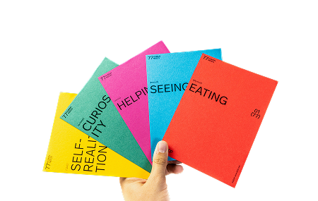
The UX London is a conference specifically focused on user experience. Over 3 days (May 20 - 22), exciting lectures and interactive workshops were held at Trinity Laban in London. For me it was the first participation and I focused on the two days on the topic "People" and "Platform". In the following I will give you an insight into 4 contributions that I liked especially well:
Sweating the UX Details
Already the first lecture of @stephenanderson has stimulated to think about the own working method and its focus. Everyone likes well-designed things and a good user experience. But Stephen Anderson emphasizes that all too often our processes or organizational cultures prevent us from focusing on this. Deadlines usually take priority over thoughtful details. Animations are often cut away when budgets and/or time are tight. But animations are best suited to show the user his way and to create a positive UX. For example, they show how an element is transformed (Material Design by Google) or lead the user's gaze to elements that are in focus (Login and registration of Readme.io). Therefore, every company should always ask itself the question whether the focus of the results is on quality or delivery.
Meanwhile, there are many companies that are focusing more and more on smooth UX. These companies focus on small details. For example, Medium.com, which has "Best Tool Reading Experience" as its goal, has invested one month to optimize the appearance of its hyperlinks. More such examples and a deeper insight into how we can reach "awesome users" can be found on SlideShare:
Sweating the UX Details from Stephen Anderson
Content in a zombie apocalypse session
@karenmcgrane once again points out that it is important to consider the content itself and the preparation for a specific platform separately. The rapid development of an infinite number of new mobile devices, platforms and screen sizes compares it to a zombie invasion that we have to be prepared for or are already in. There are not enough designers, developers or editors available to individually optimize and customize the content for each new device. In addition, there are masses of innovations whose meaning is not clear to everyone, such as the display with Twitter access on the Internet fridge. In contrast, Karen McGrane suggests viewing content independently of the device and preparing it in such a way that the content can later be adapted to the device and context - content modeling is the keyword here. A content should no longer be the big hodgepodge of everything in a WYSIWYG editor, but should be available as differentiated chunks that are then specifically prepared and displayed.
In her lecture Karen McGrane shows in an individual and funny way how to defeat the blobs and give the chunks their space:
Content in a Zombie Apocalypse from Karen McGrane
My tablet is my teddy – how understanding children can help you design for anyone
Also recommended was the insight into the work of LEGO. Cecilia Weckstrom (@ioedge) and her colleague Kayleigh Davis presented how, with the help of children, they not only improved the website in terms of structure and navigation, but also what influence the findings had on product presentation and wording within the company. For example, figures are classified according to "good guys" and "bad guys" and are no longer referred to as figures but as characters. Thumbnails that represent a video are given a timestamp that is displayed on the image, as children know this from YouTube. And in the case of building sets, a pack is shown so that you can see that it is not an online game, but a Lego set.
During their analyses and research they found out that children, just like adults, are already under great time pressure. This is especially true when they work on mobile devices. They only have a limited amount of time available for this, as parents usually limit it to one limit per day. That's why children are now also more goal-oriented within the apps and websites and don't give products that don't get them to their destination a second chance. This leads to the realization that children, too, need a simple and fast navigation option instead of a playful approach. Furthermore, the context always determines the content. The content should adapt to the usage and the current situation and be displayed in an optimized way.
Cecilia Weckstrom and Kayleigh Davis have succeeded in showing how the integration of real users not only optimizes a website and makes it intuitive, but also breaks down entire company formations.
Working with Atomic Design
@brad_frost makes it clear that all structures, no matter how complex, can be divided into individual molecules, which can then be broken down again into their elements (atoms). Every design of an interactive application can be divided in the same way. On the atomic level there are buttons, input fields, headings etc. These in turn can form a search module (molecule). The so called Atomic Design offers an effective design system, which consists of 5 different steps: Atom, molecule, organism, template and page.
If you start to focus on the individual atoms, a consistent design is created and it offers the possibility to work out subtleties on individual elements. If you don't do this, for example, a website is created that contains up to 20 different button styles, and this without any reason. Instead of providing screens at the beginning, which show a complete interface, the look and feel of the atoms and molecules is adjusted and sheets are created, which represent this look and feel. Only when these are set, complete screen designs are created.
To show that it is not complicated to develop a consistent design, Brad Frost integrated drawings by a girl from the kindergarten into the lecture. It is remarkable how complete and thoughtful the drawings are. Brad Frost also makes his lectures available on SlideShare.
Finally…
... is to say that even now, a week after the conference, I am still very impressed by the contributions and the food for thought they provide for daily work. The level of the speakers was very high, with very few exceptions. In addition, the location Trinity Laban contributed to the exchange of ideas with others in the sun on the lawn tribunes during the breaks and to enjoying the beer brewed by the organizer himself in the evening.
In addition to the lectures, half-day workshops were also offered. Adam Connor with his workshop "Discussing Design: Getting and giving better feedback through critique" is especially noteworthy. I will report on this in the following article.

.jpeg)


