
Error messages are not good per se. After all, they tell you that something has gone wrong. Double annoyance if the user does not understand why the error occurred and what he can do now. The reactions vary: One person curses loudly about the software, another would like to get his cell phone out of the window and the third may never open the app he is using again. But although error messages have such a high frustration potential, they are often neglected in the UX conception.
What is the reason for this?
Sometimes the UX Konzepter does not really know what error messages can occur. He assumes that the developer is more familiar with them and leaves this topic to him. The result looks like this:

The user is informed in English about a problem that he/she neither knows why it occurs nor what he/she can do about it. Instead, he is informed of the backend name and the number of the error.
Or the UX Concepter deals with the definition of all error cases, but is not responsible for writing the UI texts. However, the copywriter who is responsible for this does not know the different error cases. Possible result:

All error messages receive the same meaningless sentence. But at least we tell the user that we are sorry.
How can we do it better?
First of all, we should look at each error case individually and also give it a specific error message. Only then can we really tell the user what went wrong. Is that how it works?

The user learns what happened and is happy? Not quite. It remains unclear what he can do now. So maybe we should add to that.

It would be interesting to know how many users read this error message and then actually know which of the three buttons to choose.
So obviously, it's not only what we tell the user, but also how. But let's hold on for now. Effective error messages show the following information:
- What went wrong and if possible also why
- What can the user do to solve the problem
On the way to the perfect error message
As the above example shows, error messages should be kept short and clear. The user is already annoyed anyway that something went wrong. Now he does not want to read a novel about it. So the goal is: As short as possible, but as detailed as necessary, so that the user gets all the necessary information.
As with all UI texts, the same applies to error messages: we should speak the language of the user. And this means not only the national language, but also that we avoid using technical jargon that is unknown to the user.

Usually we know what language our users speak. Then such an error message language course is unnecessary.
In addition, friendly and polite communication cannot hurt. And under all circumstances we should avoid blaming the user for the problem. Sounds logical, but happens again and again.

For example, Word complains to me that my document contains too many spelling and grammatical errors just because it cannot handle the many technical terms.
An error message could even provide the opportunity for a little joke to keep the user's mood in the green zone. Of course, you have to be very careful that the tone matches the product and the target group. But if that is the case, why not try it that way:

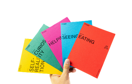
Or even like this, with nice graphics:

Well-considered error messages can ultimately even contribute to the brand identity of the product. And let the user continue with a smile instead of a curse. Reason enough for us UX concept developers to address this issue and not only think about error messages but also formulate them.


.jpeg)


