
Details about the relaunch of the coeno website
Since the middle of last year we have been working on the new appearance of coeno. The aim was to present ourselves in an appropriate way and to adequately reflect the multifaceted character of our agency. Here I would like to trace the development and illustrate why we are convinced that our new appearance gives an informative and inspiring insight into our agency.
As time went by, we had grown tired of our previous image, which as Art Director of coeno is particularly close to my heart. Our previously very clean website proved to be a bit too reduced and inflexible, especially due to its visual limitations. But also changes in the agency, driven by new employees who brought new impulses, new working methods and service modules, could no longer be adequately reflected.
Our new appearance should do justice to all this and not only illustrate how we see ourselves, but also meet the expectations of our visitors.
How will we communicate is determined not by how well we say things, but how we are understood – Andrew Glove
Get the sledgehammer
In order to create something new, we decided on a versatile approach:
- Interviews with all employees should make clear what each individual expects from our new appearance. A customer survey gave us an additional insight into how we were perceived from the outside.
- A benchmarking of the web presence of well-known agencies illustrated how the stage Internet is used elsewhere.
- A creative workshop served to collect different navigation paradigms. Our designers were then able to develop a design framework with the greatest possible freedom to present coeno in an independent and purposeful way.

1. interviews with the team
At the beginning of the project Bettina asked everyone in the team about their expectations of the new appearance. Many aspects came up for discussion. In sum, it also became clear that the structure of the existing presence did not form a bad basis for the coming appearance:
- Our projects should continue to be in the foreground, but their special features should be elaborated more and told and visualized in a varied way as an exciting story.
- Our way of working must be depicted in a clear and comprehensible way, our range of services should be easy to grasp and clearly arranged.
- But what distinguishes us from other agencies is us - as individuals as well as a team. That should become clear.

2. Benchmarking agency sites
Learn the rules like a pro, so you can break them like an artist – Pablo Picasso
Digital design trends are a double-edged sword: On the one hand, dozens of articles regularly show entire stables of new sows being driven through the village. On the other hand, if you look closely, the fattening cattle often turn into mayflies. Or trends prove to be plagiarism with a new name.
Just to give an example: Flat Design is since the appearance of the Windows XP Media Center Edition 2006 regularly under different names - Metro Design for the Xbox Relaunch, Modern Design or Material Design - present on the list of popular trends, without much visual change. Happy birthday!
Essentially, however, three clear trends could be identified in agency appearances:
- The works are always in the foreground and are presented on a large scale.
- The page structure is flat and is hidden in burger menus (often also on the website) and only visible at second glance.
- Apart from a mission statement, the services are rather vague and usually not very meaningful.
We did not want to follow these approaches entirely.
As an agency that stands for intuitive usability and an eventful user experience, we have decided not only to illustrate our intention in a striking way, but also to show the visitor the way with familiar interaction possibilities. And to make information connected with links a trouble-free experience. This is reflected not least in a classic navigation on the website.

3. The team as motor for a perfect appearance
In a workshop, we collected ideas for conceivable interaction paradigms and view types. The basic layout could be designed visually without any limitations: More color should characterize the new appearance. More variance was to provide variety with different, information-driven views.
For example, with individualized team pages on which everyone can place their own content. Or with project detail pages, which highlight the thematic focus of a single project under the customer's brand. As well as the "What's new" section on the start page, which - based on the widely used card design - creates a place where our visitors can quickly find out what drives us at the moment.
Not surprisingly, given the expectations of all our employees, every view had to be revised and improved umpteen times. Here I would like to briefly introduce three types of views and their creation cycles, as examples.
Changing views
Project Mosaic - A versatile project wall was created from an equivalent mosaic, thus giving each project its own visual approach. At the beginning we experimented with numerous equivalent tiles. Since these seemed to be too colorful and confusing, and also referred to different page types, we separated the showcases and decided to display them in a varied way with large teasers.


Team detail - from a collection of extensive information, a maximally personalized page was created for everyone, on which their own interests and activities can be posted. In the beginning, we overdid it with too much information, making the employee page look almost like a catalog page. A freely configurable timeline now provides variety and a personal touch.


Services - from a stringent illustration of our services, we designed a diagram that illustrates flexibility and innovation. With the performance side we wanted to achieve two things above all: Our range of services should be clearly visible at a glance. At the same time, however, we also wanted to create space to go into our service modules in more detail.
In the course of time we gained two insights: A linear representation of our services no longer corresponds to our way of working. And a simultaneous display of all services, as well as details of each module, is too much even for monitors with high resolutions. Therefore, on our performance side, one element now follows the other and the available space is ideally used.


The new corporate design and how we see ourselves
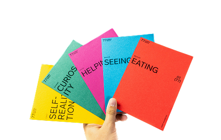
We are convinced of our new look: our website tells who we are, explains how we work and vividly describes what we believe and work on. It is intuitive to use and presents itself in a contemporary and varied look. And we didn't have to discard everything: After experimenting with new fonts, I came to the conclusion that our somewhat futuristic-looking house font Titillium still suits us well, and that the ravages of time had no effect on it. The new, rich colors also fit in well with the existing color grid and now make our appearance appear friendlier, stronger and above all more individual.
I mean, our appearance invites you to go on a voyage of discovery, to get to know us and to come back again. Because as the digital world is changing, we too will continuously change and expand our presence. And we hope to surprise our visitors with something new every time they visit us.
Also worth reading in this context:


.jpeg)


