There are numerous blog posts and articles in which the authors try to explain the differences between standard and high resolution displays. I have to admit that I have my difficulties with the different approaches I have read so far. Sometimes virtual pixels have to be used to explain the peculiarities, sometimes device pixels are puzzling or fundamentally new approaches are required for high-resolution displays. Quite complicated, in my eyes too complicated.
If you sat down in front of a monitor or even a laptop 5 years ago, everyone - I include myself - was convinced that the image on the display was 72 DPI, after all that is the resolution at which all graphics are created for display on a computer screen. It is therefore not surprising that another criterion became more important for differentiating the devices, the number of pixels that can be displayed on the X and Y axis. Even today, we still use the term screen resolution incorrectly when we don't mean pixel density but say that an HD display has a resolution of 1920×1080 pixels. Finally, this simplified view ignores whether the display has a 3.5" or 40" diagonal. With the triumph of high-resolution displays in smartphones and the like, this approach presents us with a serious problem of understanding.
Pixel is not equal to pixel or why the pixel cannot be a fixed size
As long as the display dimensions and resolutions were relatively close together, the pixel could be considered a fixed size. In this form, the pixel specification served as a unit of measurement for size specifications on the screen, e.g. for fonts or line thicknesses. Today, it is becoming more and more clear what has always been true: not all pixels are equal.
Pixels are usually equated with the raster points of bitmaps, after all, they are also called pixel graphics. A bitmap with 720 x 720 pixels has 518,400 individual raster points. For each of these graphic pixels, the X and Y position and the corresponding color value are defined. However, the graphic pixel does not have any information about its real dimensions. Even if the specification 72 DPI suggests otherwise, the dimension 720 x 720 pixels says nothing about the real display size. After all, the number of pixels per unit area can vary greatly on the display used. Usually it is not 72 dots per inch. Just compare the area of a 3.5" HD smartphone display with that of your 42" HD TV. Both devices have exactly 2,073,600 device pixels at 1920 x 1080 pixels. On the TV screen, you will be able to see a single device pixel even better when you look closer, since the device is not particularly high-resolution with a screen diagonal of 42". Sitting on the couch at an average distance of four meters, this circumstance will not bother you further.
We also use pixels as the unit of measurement for size indications on the screen. If the CSS defines that an HTML element should have a red line with a line width of 1px, the graphics processor tells the device pixels of the relevant row to display red. If, on the other hand, the line width is to be 2px, the device pixels of the adjacent row must also light up red. This makes it clear that the size of pixels always refers to the device pixel and the real size of the output can vary accordingly.
The special feature of high-resolution displays
High-resolution displays have significantly more device pixels on the screen surface than a standard display, resulting in a sharper image. All graphic elements whose dimensions are related to the device pixel, as already described, are inevitably displayed smaller. This relation would have the consequence that the representation on the high-resolution display would not be recognizable anymore, because it is simply too small. A 1px wide line would be hardly recognizable under these circumstances and writing would no longer be readable.

To solve this problem, the graphics driver High Resolution Displays converts all pixel-related style definitions. For example, the size specifications in the CSS are multiplied by the resolution factor of the device. Therefore Retina and other displays with double resolution use 2 rows of device pixels instead of 1 row of device pixels to display a 1px line. So the line is actually 2 device pixels thick. An HTML element with a defined edge length of 100px actually has 200 device pixels in the X and Y direction. Font, which is 12 device pixels in a normal display, uses 24 device pixels in height, just to name a few examples. With this trick, the elements are just as large as those of the standard resolution, but much sharper.
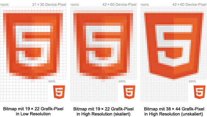
However, this principle does not work for bitmaps, which, as images, background graphics and icons, are an elementary component of almost every user interface. Images can be scaled, but missing image information cannot be added later. For high-resolution displays, every bitmap must therefore be created in a higher resolution. The target size depends on the resolution factor. Retina-optimized bitmaps are exactly twice as large as in the standard resolution.
Conclusion
The real difference between normal and high-resolution screens is that the style definitions of high-resolution displays are converted according to the resolution factor. This does not apply to bitmaps whose resolution cannot be increased afterwards. They must be created in a high resolution version.

.jpeg)


